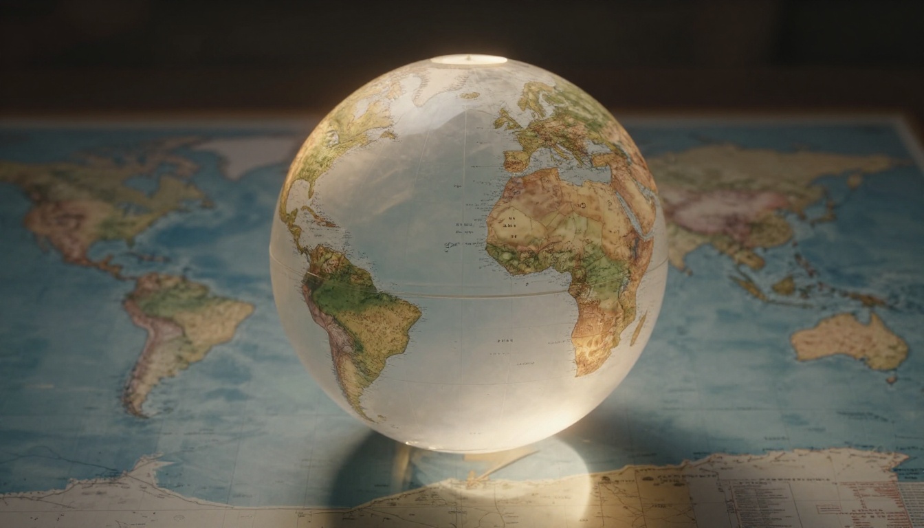
Have you ever stared at a world map and wondered why Greenland looks almost as big as Africa, even though it’s not? You pull out a globe or check real sizes, and suddenly Africa dwarfs Greenland. This mismatch happens because Earth is a sphere, but maps flatten it onto paper or screens. No flat map captures a round planet perfectly.
Distortions creep in with size, shape, and distance. They stem from map projections, math tricks to squash the globe. Mercator projection tricks us most because it boosts polar areas hugely. Sailors loved it once, but today it skews our view of the world. People get wrong ideas about country power from these maps.
You will see the core reasons for these odd looks. Then discover better options and tools that show truth. Keep reading to fix your mental map.
The Tricky Challenge of Turning a Globe into a Flat Map
Earth’s surface curves smoothly. Maps force it flat, so something gives. Imagine trying to wrap gift paper around a basketball. It bunches up or tears.
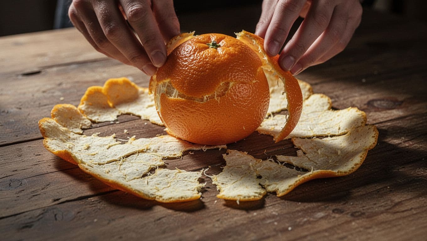
Think of peeling an orange. The skin curves perfectly on the fruit. Flatten it, and wrinkles form. Gaps appear too. Cartographers face the same issue.
In 1827, mathematician Carl Gauss proved it mathematically. You cannot flatten a sphere without stretching, tearing, or crumpling parts. All maps trade off accuracy. Projections use formulas to choose what stays true: size, shape, or distance.
Ever tried flattening a balloon? It resists. Maps do the same. So distortions vary by method.
Sizes Get Stretched, Squished, or Both
Near the poles, land balloons out. Greenland swells to look massive. Africa near the equator shrinks a bit. Russia and Canada stretch north.
This happens because lines of latitude squeeze closer at poles on a globe. Flatten it, and gaps fill with stretch. Equatorial areas compress to fit.
Real impact? You guess wrong distances. A trip from New York to Tokyo seems shorter than it is.
Shapes and Directions Twist in Unexpected Ways
Shapes warp too. Africa might look tall and skinny. Greenland rounds out unnaturally.
Distances bend. Poles measure wrong because meridians converge on globe but spread on map. Sailors notice this most.
However, some projections keep shapes right locally. Directions stay true for compasses. Trade-offs always linger.
Mercator Maps: Great for Sailing, Terrible for Sizes
Gerardus Mercator drew his map in 1569. Sailors needed straight lines for compass courses. His design kept shapes and angles perfect. A course plotted straight on paper matched sea reality.
But sizes explode away from equator. Greenland matches Africa’s map size. In truth, Africa spans 30 million square kilometers. Greenland covers just 2 million. That’s 14 times smaller.
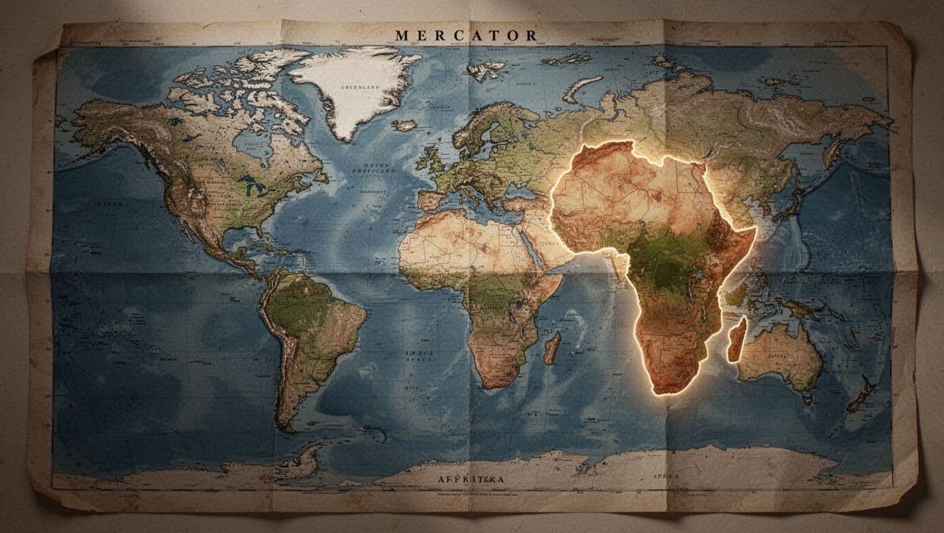
For details on why Mercator distorts Africa’s true size, check this comparison. Poles get huge. Antarctica wraps the bottom like a monster.
This map hangs in classrooms and offices. It downplays equatorial nations. Africa seems small next to Europe or North America. Yet Africa alone tops the US, China, India, and most of Europe combined.
Alaska looks Texas-sized but fits inside Texas 3 times. Russia spans map edges hugely. Cultural bias builds from this. Northern powers seem dominant.
Google Maps used Mercator for years. Now shifts help, but old habits stick.
Real Examples That Will Surprise You
Greenland versus Africa tops the list. Map lies big time.
Africa covers more area than the US, China, India, Japan, and Europe added. Map shrinks it.
Brazil looks modest. Reality? It dwarfs the lower 48 US states.
Russia stretches across the map. True size impresses less without pole boost.
These shocks make you rethink travel plans or news maps.
Better Projections That Show a Fairer World
Cartographers built fixes. Equal-area maps keep sizes true. Shapes suffer a little.
Gall-Peters from 1973 stretches vertically. Africa looms large and correct. Europe shrinks right.
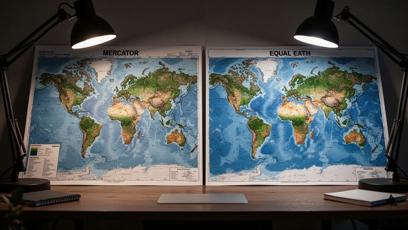
Equal Earth launched in 2018. It balances sizes and shapes nicely. Africa fits real scale without tall stretch. See a comparison of Equal Earth vs. Gall-Peters.
Schools ditch Mercator now. Campaigns push Equal Earth for fair views. Kids guess sizes better with these.
Robinson from 1963 compromises well. Sizes and shapes both okay-ish. UN uses it often.
Goode’s projection cuts oceans into pieces. Land stays accurate. No single view rules all.
Trends grow. Equal Earth gains fans for natural looks.
Equal-Area Champs Like Gall-Peters
Sizes nail it. Africa dominates as it should.
Shapes twist. Continents elongate north-south.
Good for area stats like population density. Less for navigation.
Balanced Options for Everyday Use
Robinson smooths distortions overall. No wild stretches.
Equal Earth looks familiar yet true. Oceans curve nicely.
These suit posters and apps. Better mental pictures result.
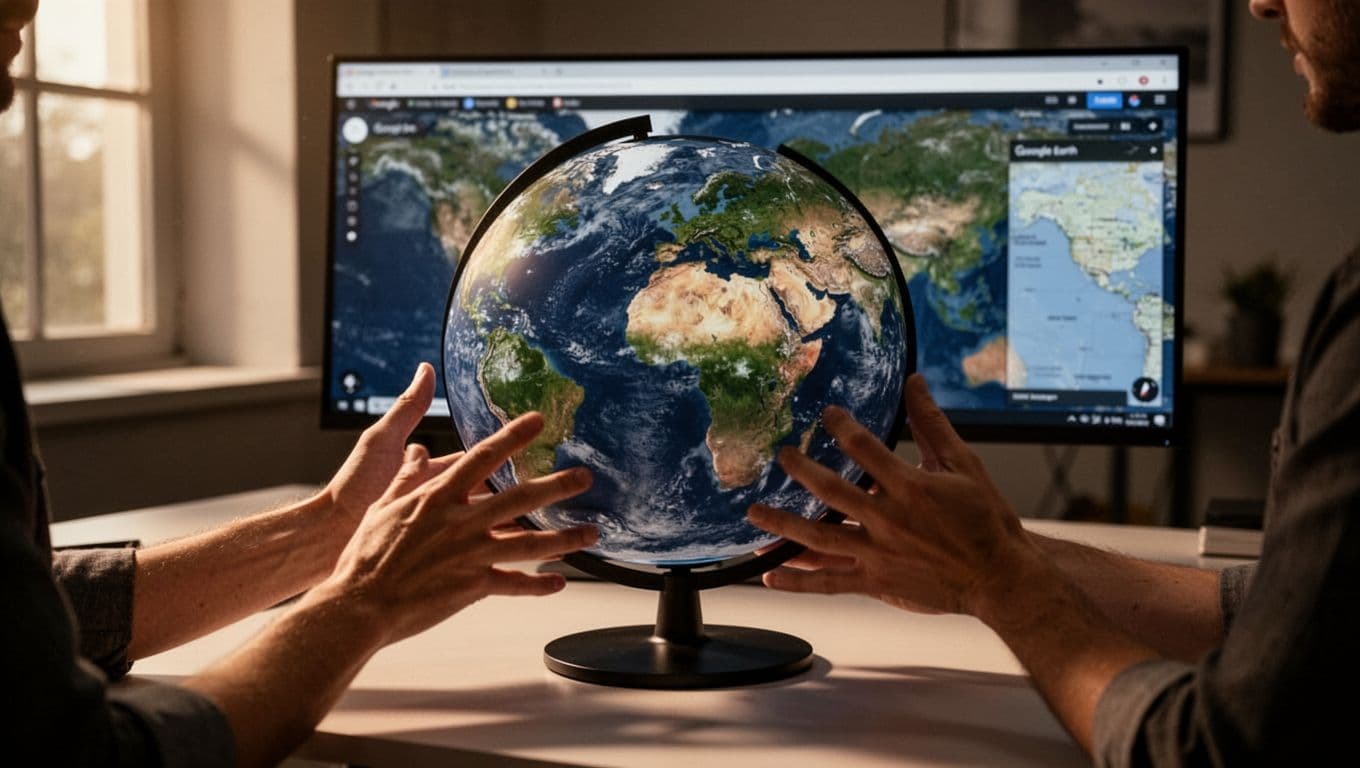
Interactive Maps and Globes: The Modern Fix
Flat maps limit us. Interactive tools spin the globe in 3D. No distortions hit all at once.
Google Earth lets you zoom from space to street. Sizes stay right as you view.
Apps like these boom in 2026. Digital maps hit $31 billion market. Interactive types lead with 68% share. They grow 15% yearly.
Google Maps added globe view. Ditch Mercator defaults. For more, read how Google Maps ditches Mercator.
TED-Ed videos teach this. Schools use GIS layers now. Spot climate or population true.
Try it yourself. Open Google Earth. Spin to Africa. Truth hits fast.
Spot the Differences and See the World Right
Maps differ from reality because spheres flatten with trade-offs. Mercator helped sailors but fools sizes today. Better picks like Equal Earth fix that.
Question every flat map you see. Grab a globe or app for checks. Greenland shrinks, Africa grows true.
Share your biggest shock in comments. What map tricked you most? Fire up Google Earth now. Fairer views await. (1492 words)